
I have a boox note pro. Why does the handwriting on boox look like a caricature drawn by a 3-year-old kid? When I wrote on galaxy note tablet or ipad, I had a totally different experience. Is there any app or setting that can help improve the handwriting?
5 Likes
Dear Claire,
thank you for this suggestion.
I don’t think that is the reason.
There are several people in the forum reporting about this issue.
It is just that the drawings are pixelated. It is rather about the smoothing of lines
than about the input.
Might, for example, also be related to this thread: Please save the scribbles as Ink, not PolyLine
Will try to make a picture and show you.
Best,
Dennis
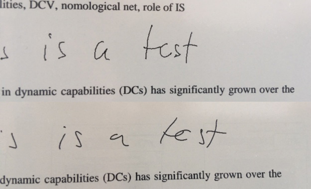
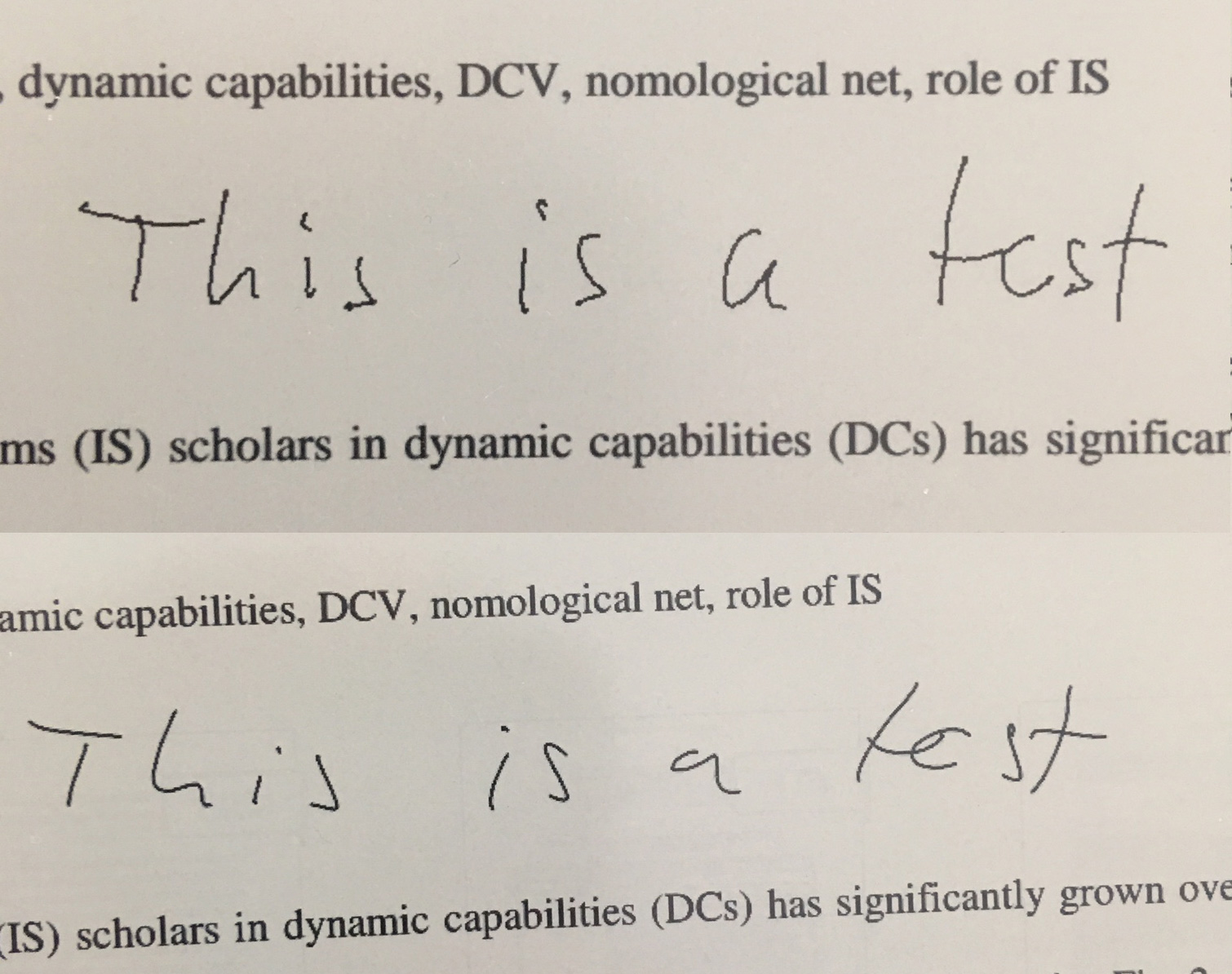
@claire: Here I attach some samples from the blurred/pixelated annotations with the pen.
For comparison, I add the same from a competing product (which has many other issues ;-)) where this problem does not exist.
Onyx is always the upper one in the pictures on a Note Pro with 2.1.2.
In one of the pictures I have also selected some writing for you to see the difference between the two types of saving annotations. Onyx seems to save them as individual small lines while the other as objects.
You can clearly see that my handwriting is much more readable and nice looking in the other device. This is what we need for the great Onyx devices too!
PS: You will need to save the pictures and look at them with a 100% scale to see the full problem.

Hello Denis, noted with thanks! Will forward this to our R&D department and will keep you updated.
2 Likes
Yes very much agree here
This also bothered me from the beginning
I think no matter the input there should be a path smoothing algorithm indeed
(as long as it doesn’t add lag - or apply smoothing when writing finished)
1 Like
any news on this? I also just bought my note pro and im quite disappointed by the quality of the lines, they are all pixelated! Please let us know if there will be an improvement on this soon
3 Likes
Yes, our R&D team are working on this and will keep you updated. Hopefully, it will be improved at the next firmware update.
The same thing with writing accuracy. Onyx Note Stylus is more about fast notes, giving so small attention to accuracy. To start, manual calibration using app in the settings can’t give this accuracy, also E-book usually detect stylus with some inaccuracy, especially when you tilt the stylus.
The second is not very annoying, but the first is.
Will BOOX improve the situation with accuracy, especially with calibration?
And to community: will something change if i use another stylus?
For the writing accuracy problem, please kindly submit this Service Request Form with all information needed and our relative colleagues will reply back as soon as possible.
It is not bug or something wrong with my device. It is about stylus tracking. I checked that with complected stylus I usually have some inaccuracy. For half or quarter of a millimeter. I tried Samsung S Pen and it gave me a bit more accuracy (I can’t make comparison, because did it in a shop). I suppose that the problem is directly in stylus (the tip is too big), and maybe in software (denisdd described this problem). And again, i’m sure that it’s not bug, because inaccuracy is too small, but it affects on handwriting. I’m using Surface Pro and having no such troubles with quality of handwriting.
Hello, could you kindly provide a video to illustrate the problem?
Hi. I’m just about to buy note pro.
Will November update improve problems with draw/notes smoothing that pj123 and dennisdd mentioned? Noticed that on few review videos - for example here: https://www.youtube.com/watch?v=5yab9I9eHSA - at 1:30 jagged lines are visible on note pro and after that when he draws something on max3 and finishes a stroke, smoothing action of drawing on max3 is visible. Would be great if same action is performed on note pro.
Also, on one review of latest update 2.1.2 I saw that pinch to zoom and pan around on pdfs (on note pro) is not as fluid as before, is that fixed or will be fixed?
Thank you and Best Regards,
Ivan
I also mentioned in another topic about the calibration inaccuracy, which is one thing, and doesn’t affect the smoothness of writing (or lines etc.), but that inaccuracy makes it sometimes near impossible to erase part of text and continue. The new letters will not get the right location relative to the existing text…
The text smoothness:
At least on the older example photos, it seems that part of the better look can be explained simply by slightly higher DPI display and text anti-aliasing. Seems Note pro doesn’t do any antialiasing, so the pixel “steps” can be seen easier.
That doesn’t explain it all; obviously the other device gives smoother curves (whether by better tracking, or applied smoothing, or both…) I got interested about it, and compared my Note Pro, Galaxy Note 9 and Note 10, by drawing straight lines with a ruler. Straight lines only reveal tracking error, not how well it smooths lines (obviously, some wobbles need to be left, otherwise everything would result in just line segments :P). Of course, both Galaxy’s have insanely higher DPI displays, so they don’t need to care about anti-aliasing.
Using Galaxy pens on Onyx didn’t give any different in accuracy for me.
(EDIT: I made way more lines… I’ll retract the stuff about systematic (calibration based) errors on diagonals, call it a brainfart; if that was the reason, such errors should also happen on horizontal/vertical lines. Whatever the reason is, the closer to 45 degree angle a line is, the worse it looks. I had to even find another ruler, just in case the first one wasn’t as straight as I thought, but no change. For some reason, the wiggles seemed to be on the same spot on each nearby lines on the first tries, also note Note9, but now with more tries on Onyx, I don’t really see matching wiggles, except possibly within back-and-forth strokes along ruler.)
Onyx has a little bit of random jitter (really little, apparently well below pixel average “noise”); for me, that was expected, though it could be filtered out. When drawing other than horizontal or vertical lines (i.e. various angled/diagonal lines) also shows systematic small shifts (i.e. same shift every time at the same spot), way more than a pixel worth. (Vertical/horizontal lines look really straight, no small wobbles, but the calibration errors make such lines to have slight angling compared to the ruler’s position, and could also make slightly curved lines, if the calibration errors happen to be just that way over of the line’s path.)
Note 9 had less random errors (almost none), but surprise, diagonals revealed it also does systematic small errors, of about the same magnitude as Onyx (or maybe less, smaller pixels after all, could make it look worse than it is). It’s text output is smoother, with just couple test O’s getting a tiiiny bit of angles in them.
Note 10 was best, with even the diagonal systematic errors so small that I’m not sure if it was my ruler slipping instead (it has very very slippery display surface), even on angled lines. I even tried to make it not detect them as straight single strokes, still good.
(EDIT: so yeah, ignore this paragraph below, and some of the one after…)
Since on Onyx the errors seem to be systematic (stay the same at the same spot), very dense calibration map might solve that. Talking about max 2-3mm spacing with measurements, and possibly stored even at per-pixel resolution. The line-method I explained in the other topic would really be handy for that.
Better calibration might reduce some of the ugliness of written text etc. and anti-aliasing could help a bit, too. Better calibration would improve everything, even if/when strokes are recorded as collection of pixels (instead of stroke curves/vectors/paths or whatever one calls them) and is easy to implement. on the other hand, anti-aliasing is about impossible to implement correctly without handling the strokes as curves/paths, but if done so, implementation for anti-aliasing is easy.
For example on how much better lines/curves could be, looking at the screensaver/sleep-mode drawings, they have really fine lines/curves… and are anti-aliased. (Needed to magnify quite a bit to see that.)
But better (or any at all?) stroke smoothing (preferably optional, or its “strength” adjustable) may still be useful in addition. It also needs to handle the strokes as curves/paths, and isn’t as easy to implement, but its not really rocket science, either.
EDIT: so, some random noise/jitter (could be filtered), lacks anti-aliasing, diagonal directions somehow look to have a bit more wiggles along the line than horizontal/vertical/lower angles, but no idea how/why. Better calibration wouldn’t likely help with the last part, but would help with continuing previous strokes/text.
@rousku the waviness on diagonal lines is an artifact caused by the physical grid of the digitizer along with the pen technology used. You don’t get it with fairly horizontal or vertical lines because the pen is moving essentially along the grid lines. To understand why, you can imagine that the pen position is sensed according to where it touches relative to the grid, so when you make diagonal strokes, the position can be influenced more by a horizontal grid line in one moment and then more by a vertical grid line the next.
Calibration will not get rid of this artifact, but stroke smoothing can - the problem is that you will perceive the smoothing as lag since points need to be accumulated first and only after a certain number have been collected can some form of averaging be done.
I have this problem on two of my Microsoft Surface Pros, for example. I also had it on a previous graphics tablet, but on another one (Wacom) I don’t see the effect. Digitizers/pens can be implemented in different ways, not all of which would cause modulation of the sensed position like you see.
I’ve seen the sloped line waviness before, when using active styluses on normal capacitive sensor displays, as the effect with those is huge.
I already backed away with my idea of the diagonal wiggles being caused by the sensor system’s error, because they didn’t seem to happen the same way in the same spot after all. Some kind of small wiggling it has, but I can’t say for sure how/what/why. It could be simply the random noise, which just might become more visible in diagonals due to combination of “pixel steps”, the readout noise and no anti-aliasing, or something like that.
However, if similar effect really was the reason here, it could be calibrated away, as long as the error stays constant (and it should with that reason, at least if the pen is kept the same, too). That is, as long as the readout “function” is monotonic, constant and has enough resolution (it is all three), it could be compensated for. But it seems this wasn’t the effect here, after all.
So, even while our reasoning might be different, I think we both end up in this case with: better calibration not helping with the seen wiggles, smoothing probably would. (Better calibration would still have its other benefits, so, no reason to drop that improvement.)
Also, some smoothing can be done even without apparent delay, at least with normal displays. Sort of eye-trick combination of immediate drawing and smoothing. I’ve seen this in one android app on my galaxy devices (just don’t remember which app); it drew immediately whatever your pen did, but it also did that smoothing and with a tiny delay (“lag”) it “shifted” the stroke to the smoothed result. Quite nice, as the lag is still small enough that one doesn’t really notice that shifting, unlike when it happens with a bigger delay and a large section at once. It only smooths over relatively small time/distance , e.g. on text it is less than half the letter stroke, but that is usually enough.
Of course, on an epaper display, that might not be as simple to implement due to the redrawing causing possibly a bit of ghosting etc. I’ve seen more often the simpler way where a whole section of writing (say, a word) or drawing gets redrawn smoothed; longer delay, more visible effect, but the end result looks just the same. Still needs that redrawing (and possibly causing ghosting), but it can be done to larger area at once.
1 Like
Hello Ivan, for the strokes on Note app, we are sorry to inform you that we are not sure whether this feature will be available in the firmware update which will be released in November. It will definitely available with the Android update. The same to pinch to zoom problem. Please be patient.
Update regarding smoothing:
Got contacted by support via feedback, they said that Note Pro will get the same option “Auto refresh
after lifting stylus” as Max3 in 2.2.1 update, which will be released around end on November.
Best Regards,
Ivan
1 Like
Hi everyone,
A simple moving average on the strokes can make a huge difference. I made a little Python program to export all the notes to PDF with smoothing enabled. It looks super beautiful compared to the official export. You can find it here: https://github.com/xdever/OnyxNoteRenderer
It supports only handwriting for now, and it does not support templates - that would need some more reverse engineering.
Maybe Onyx could just add an option for moving averaging in the settings, so everyone could choose the smoothness he/she likes.
Cheers,
Robert
1 Like
If the onyx note app doesn’t splits strokes, the crude moving average will possibly do bad things for sharp corners and such. Also, while it does smooth out normal non-edgy shapes, it can also affect the shape (at least non-straight ones), although with small enough averaging range the effect would be tiny or even practically undetectable. (For example, a tight curve will get decreased “radius”, as at each point along the stroke, the local average will be a bit “inwards”.)
The stroke smoothing is quite tricky thing to get “right”. My first try would calculate the angles (between 3 points) and distances (between 2 points) from those points, and then do moving average for those angle and distance values, then recalculate back to points with the filtered values. And while I have no solution in my head right now, I’d try to detect sharp turns (like the corners of L or Z, or the center turn-back in 3), and not smooth such turn at all. Perhaps something like if the changes between steps are greater than some threshold, then no smoothing on that section.
That way the smoothing should not affect the overall shape (sizes, sharp turns), but reduce small changes in the stroke’s path.